


実績
誠晃印刷で印刷した制作物の一例をご紹介いたします。
TOKYO COFFEE FESTIVAL 04(NPO法人 ファーマーズマーケットアソシエーション様 発行)
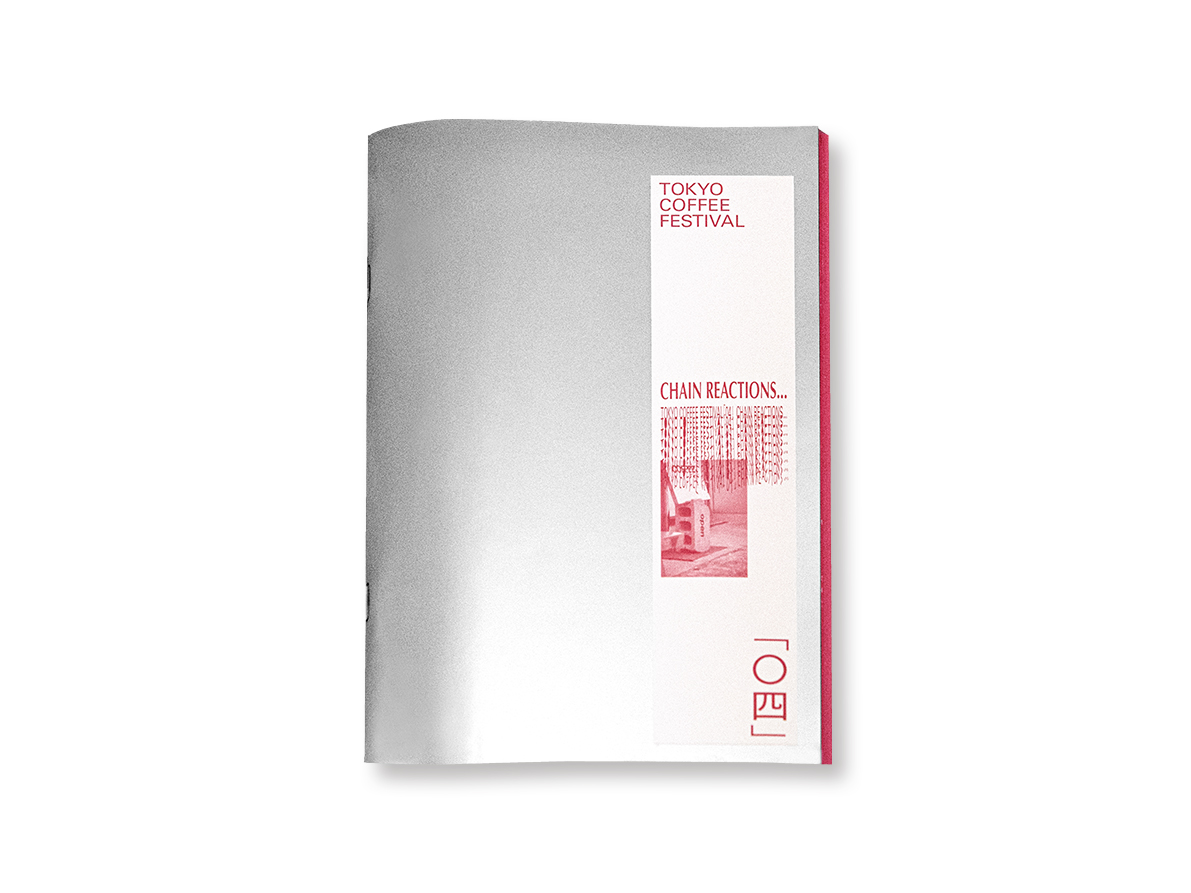
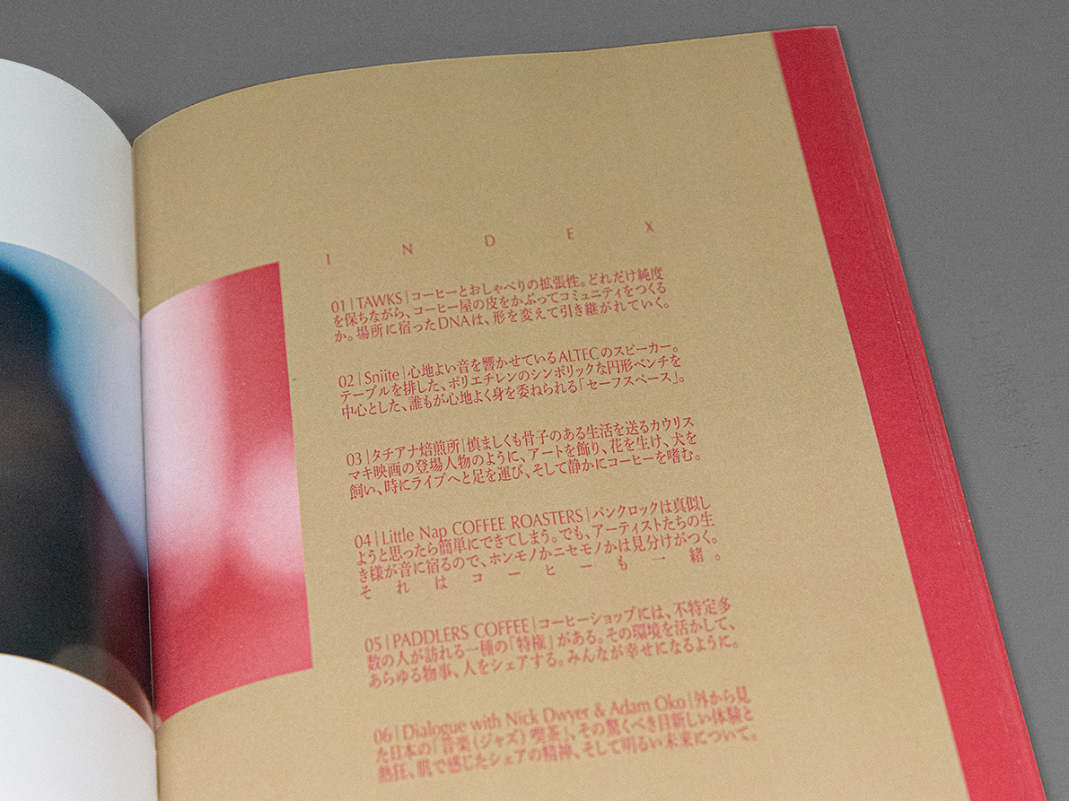
これで4号目となる「TOKYO COFFEE FESTIVAL」のZINE。日本におけるコーヒー店舗の文化を様々に掘り下げてきたZINEですが、ここまで様々な人たちに話を聞いてきた中で、コーヒー店の差異こそがコービー文化を豊かにしているという想いのもと、今回はその「差異」がどのように生まれ、空間がどのようにつくられたのかを辿るのが今回のテーマです。
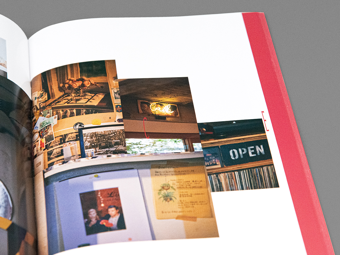
読み物と写真を入れるということでオールカラーになりがちですが、文字部分はモノクロ調で用紙も変えて表現したいというデザイン上の意向がありました。一方で形状は中綴じのため構造的な制限が付きがちな上、予算も潤沢なわけではないので、複雑な構造にもできないという本質的なジレンマを抱えました。文字原稿も編集上なかなか詰まり切らない中、印刷サイドから大まかなページ数と構造をご提案しつつ、編集上でそれを踏まえつつ世界観を実現できるような台割を詰めてもらいました。
表紙はアルミ蒸着紙(銀紙)にし情報の要素はシールを貼りましたが、擦れによる傷がつきやすく、慎重な内職作業を余儀なくされました。小口側はあらかじめ仕上げ、綴じ後の断裁はなくすることで、本になったときに中ページに行くほど小口側が出っ張る演出がなされています。
一見変哲のない中綴じの冊子ですが、実現するためには綿密な打ち合わせとリスク回避策、丁寧な作業が必要となる、ある種難しい仕事でした。工場と営業が一体となって動く誠晃印刷だからこその製品です。
判型:縦210/横120(mm)
頁数:68項
用紙:
・表紙:北雪
・本文:フロンティアタフ80、OKトップコート+
製本:中綴じ
This is the fourth “TOKYO COFFEE FESTIVAL” zine. zine has delved into the culture of coffee shops in Japan in various ways, and from the interviews we have had with various people, we believe that it is the differences between coffee shops that enrich Kobe culture, so this time’s theme is to trace how those “differences” were born and how the spaces were created.
It tends to be all color because it contains reading materials and photos, but the design intention was to keep the text in monochrome and use different paper to express it. On the other hand, since the shape is saddle-stitched, it tends to have structural limitations, and since we don’t have a lot of budget, we were faced with the fundamental dilemma of not being able to create a complex structure. As we were having a difficult time editing the text manuscript, we proposed a rough number of pages and structure from the printing side, and then took this into consideration during the editing process to create a table layout that would allow us to realize our worldview.
The cover was made of aluminum vapor-deposited paper (silver paper) and the information elements were covered with stickers, but they easily scratched due to abrasion, so I was forced to do some careful work at home. By finishing the front edge in advance and eliminating cutting after binding, the front edge protrudes toward the middle pages when the book is made.
Although the saddle-stitched booklet looks like an ordinary booklet at first glance, it was a difficult task that required detailed discussions, risk avoidance measures, and careful work to make it a reality. This is a product that can only be achieved by Seiko Printing, where the factory and sales work together as one.
Size: 210 × 120 mm
Pages: 68
Paper:
• Cover: Hokusetsu
• Text: Frontier Tough 80, OK Topcoat+
Binding: Saddle Stitched


印刷物の企画、デザイン、印刷、製本に至るまで、お客様の目的に応じた最適なプランをご提案させていただきます。