


実績[販促広報物(パンフレット・カタログなど)]
誠晃印刷で印刷した制作物の一例をご紹介いたします。
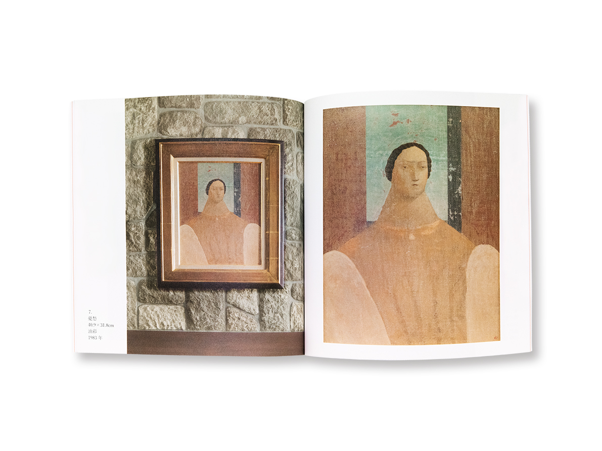
有元利夫展カタログ(株式会社花田美術 様)
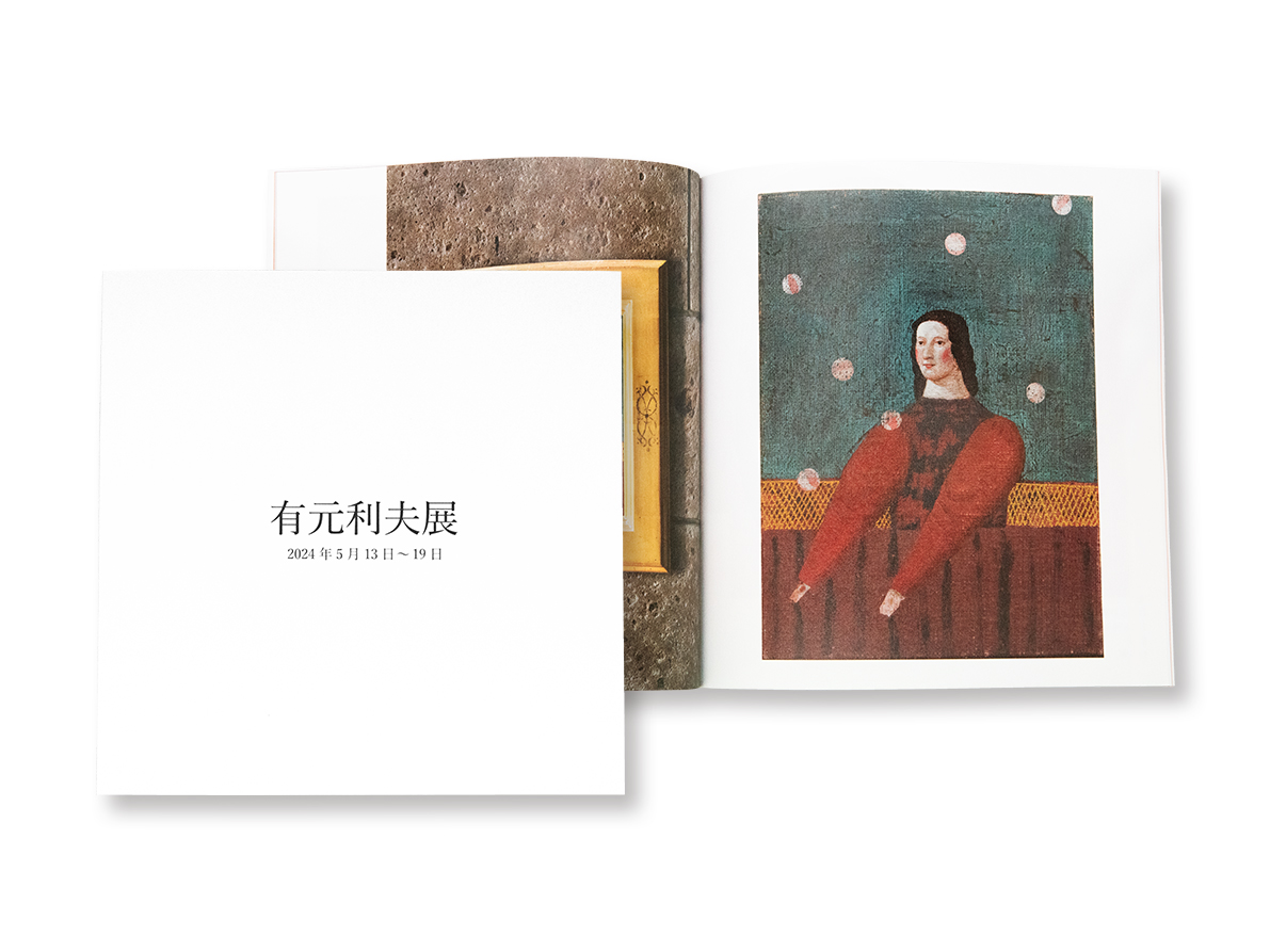
銀座にギャラリーを構える花田美術さま。2024年5月に行う「有元利夫展」のカタログ・封筒類のご相談をいただきました。
有元利夫氏は上野で育ち、東京藝術大学を卒業後、社会人勤めをしながら制作活動を継続し、個展などを開きつつその才能が認められていきます。東京藝術大学の講師を経て、1981年には新人洋画家の登竜門といわれる「安井賞」を受賞。その後も数々の受賞を得ますが、1985年に38歳の若さで亡くなってしまった早世の天才画家です。
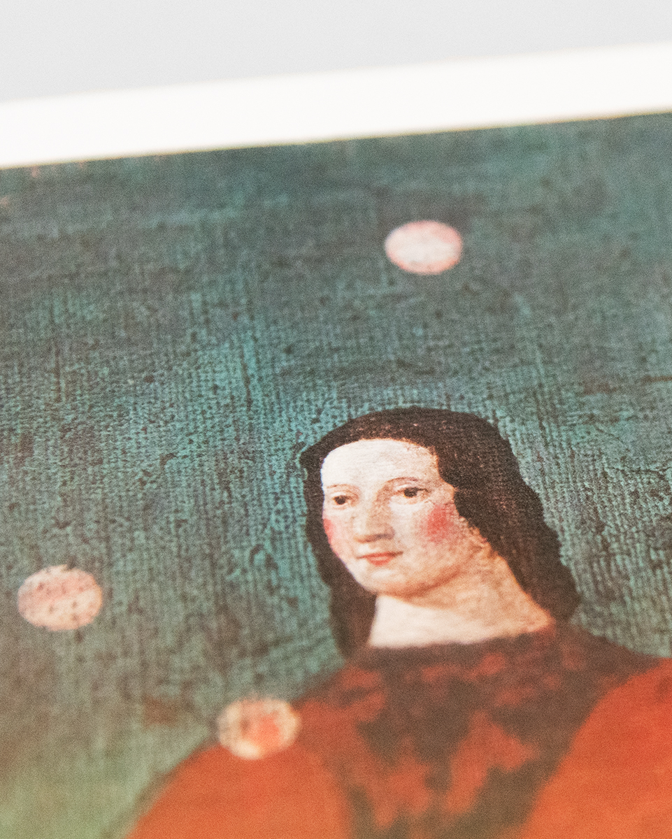
有元氏は岩絵具を使った風化を意識した作風が特徴ですが、今回のカタログではその絵画の雰囲気を実現し、色調についてもできる限り忠実に再現したいとご希望をいただきました。紙のチョイスからさまざまな打ち合わせをさせていただき、さらに色校正は現物を持ち出すことは当然できないため、ギャラリーで現物と色校正を照らし合わせながら再現の方向性を確認、誠晃印刷側で赤字を綿密に記入して、修正を加えていきました。最終的には、理想的な印刷物ができたと、お褒めの言葉をいただきました。
印刷は、通常は4色のインキしか使っておりませんが、その限られたなかで、実際の絵画の印象に近づけていくのは、技術と経験が必要です。今回は画像修正を行う人間と赤字を入れる担当は別で行いましたが、この体制で1~2回の修正でほぼご満足いただけるレベルまで精度を高めていくことができています。単純に色を合わせるのはもちろんですが、どのように修正したら本物に近く見えるかをすべてわかっていないと合格点にはたどり着けません。
見本を持ち出すことがかなわない芸術品のカタログは、このノウハウがないとレベルの高い印刷物を作り上げることは困難です。
判型:縦200/横200(mm)
頁数:30項
用紙:
・表紙:気包紙U-FS
・本文:アラベール
製本:あじろ綴じ
Hanada Bijutsu has a gallery in Ginza. We received inquiries regarding catalogs and envelopes for the “Toshio Arimoto Exhibition” to be held in May 2024.
Mr. Toshio Arimoto grew up in Ueno, and after graduating from Tokyo University of the Arts, he continued his creative activities while working as an adult, and his talent gained recognition as he held solo exhibitions and other events. After working as a lecturer at Tokyo University of the Arts, he won the Yasui Prize in 1981, which is said to be the gateway to success for new Western painters. Although he received many awards after that, he was a genius painter who passed away at the young age of 38 in 1985.
Mr. Arimoto’s style is characterized by his use of mineral pigments and is conscious of weathering, and for this catalog, we received a request to achieve the atmosphere of his paintings and to reproduce the color tones as faithfully as possible. We had a variety of discussions, starting with the choice of paper, and of course we couldn’t take the actual product out for color proofing, so we checked the direction of the reproduction by comparing the actual product with the color proofing in the gallery, and Seiko Printing meticulously filled in the red and made corrections. In the end, we received compliments saying that we had created an ideal print.
Normally, only four colors of ink are used for printing, but it takes skill and experience to create an image that closely resembles the impression of an actual painting. This time, the person who corrected the image and the person who added the red lines were handled separately, but with this system, we were able to improve the accuracy to a level that we were almost satisfied with after one or two corrections. Of course you can simply match the colors, but if you don’t know how to make corrections to make it look more realistic, you won’t be able to get a passing grade.
Without this know-how, it would be difficult to create high-quality printed materials for catalogs of artworks for which it is impossible to bring samples.
Size: 200 × 200 mm
Pages: 30
Paper:
• Cover: Kihoushi U-FS
• Text: Arabelle
Binding: Notch Binding


印刷物の企画、デザイン、印刷、製本に至るまで、お客様の目的に応じた最適なプランをご提案させていただきます。