


実績
誠晃印刷で印刷した制作物の一例をご紹介いたします。
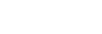
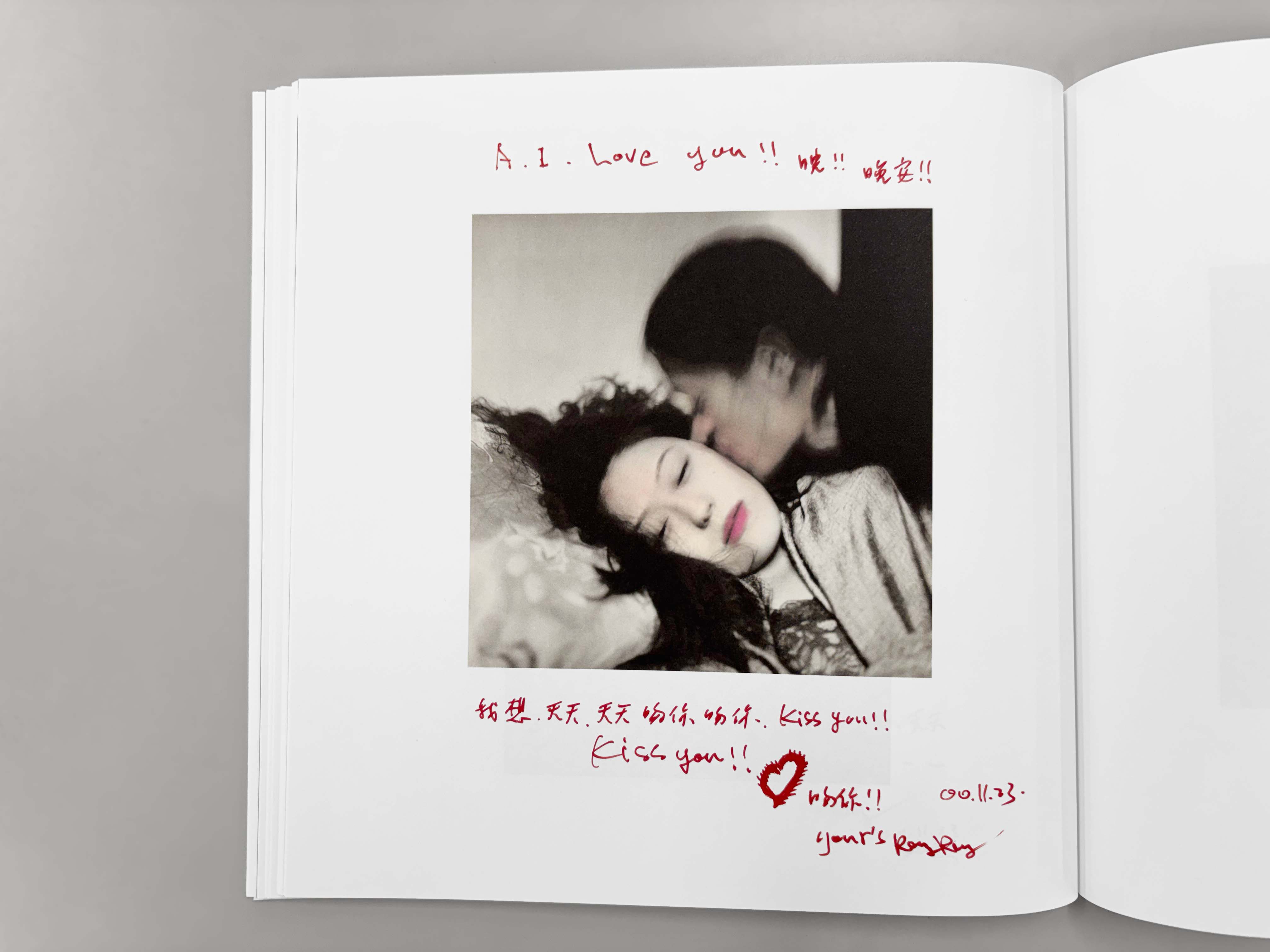
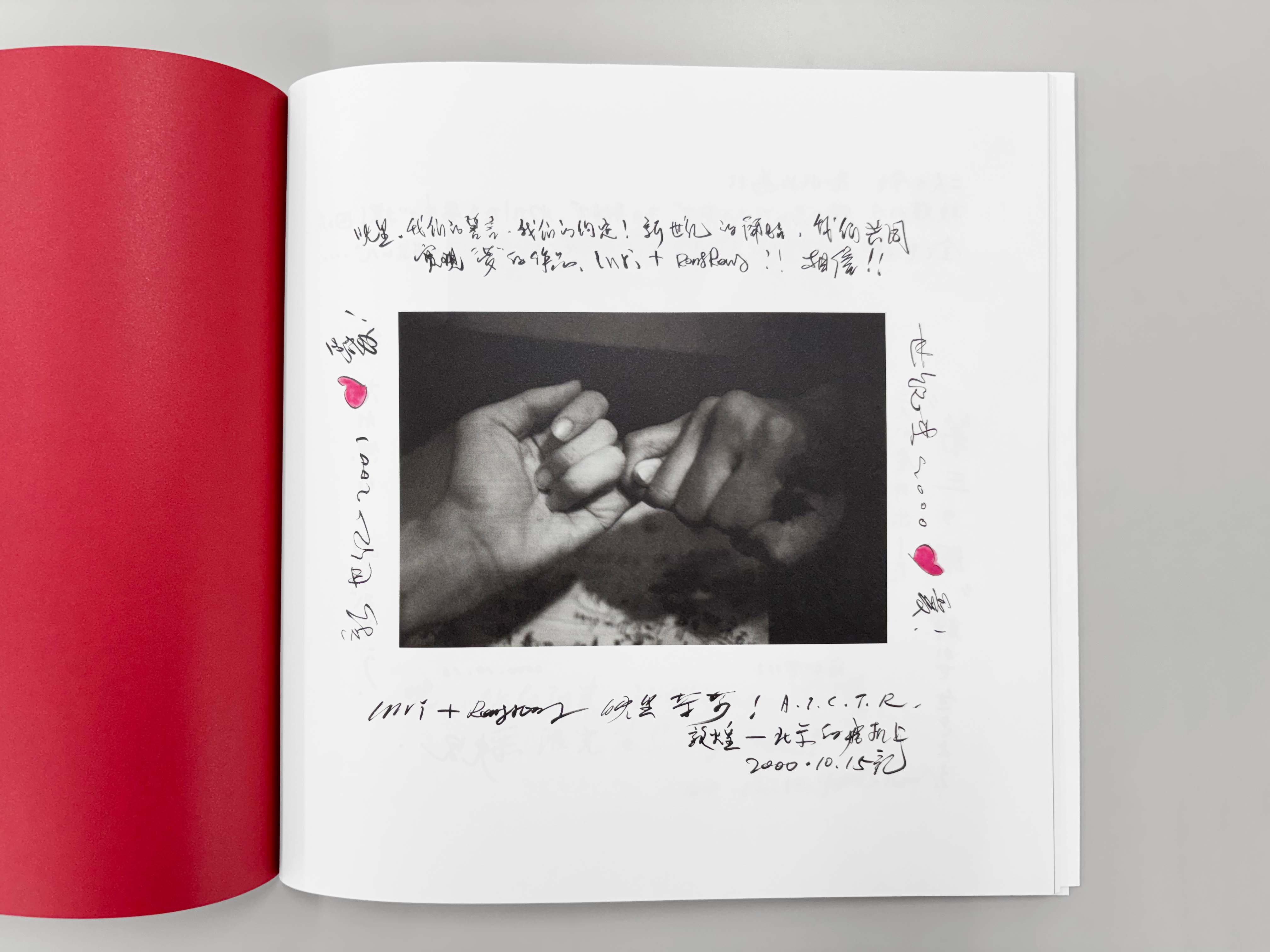
RongRong&inri | 榮榮&映里 『Love Songs ― 始まりの光』
榮榮(ロンロン・中国)と映里(インリ・日本)は、2000年より活動する写真家デュオで、写真を通じて人と人とのつながりを詩的かつ実験的に探求してきました。作品はテート・モダンやヨーロッパ写真美術館、M+など世界の主要美術館に収蔵され、国際的に高く評価されています。
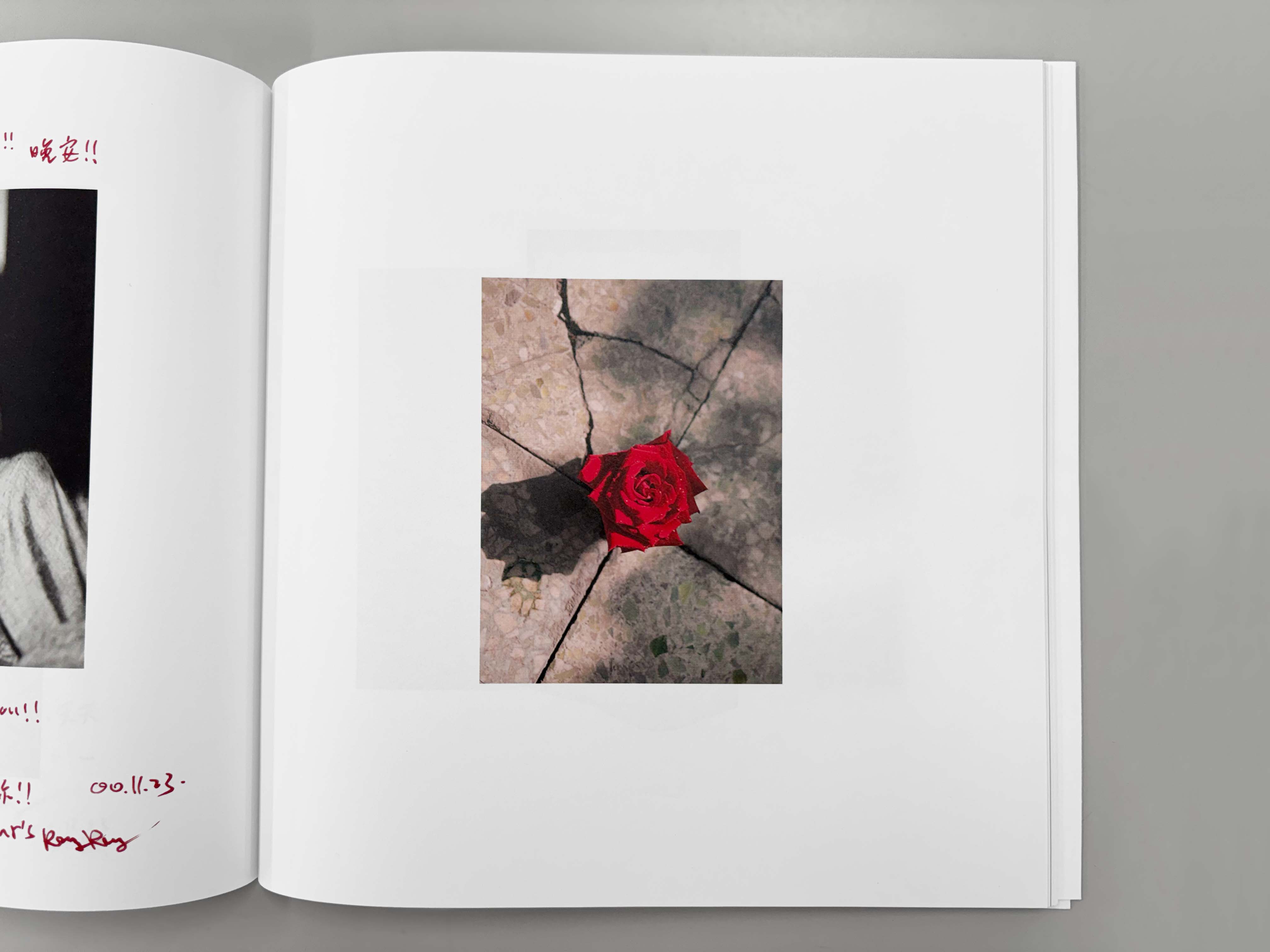
本作は、出会い直後に交わされた「写真の手紙」をまとめた作品集です。言葉の壁を越え、写真で感情を伝え合った記録であり、二人の関係の原点を映し出します。長年大切に保管され、海外展示を経て、日本初公開に合わせて、マッチアンドカンパニーの町口覚氏の造本設計により一冊の作品集として結実しました。
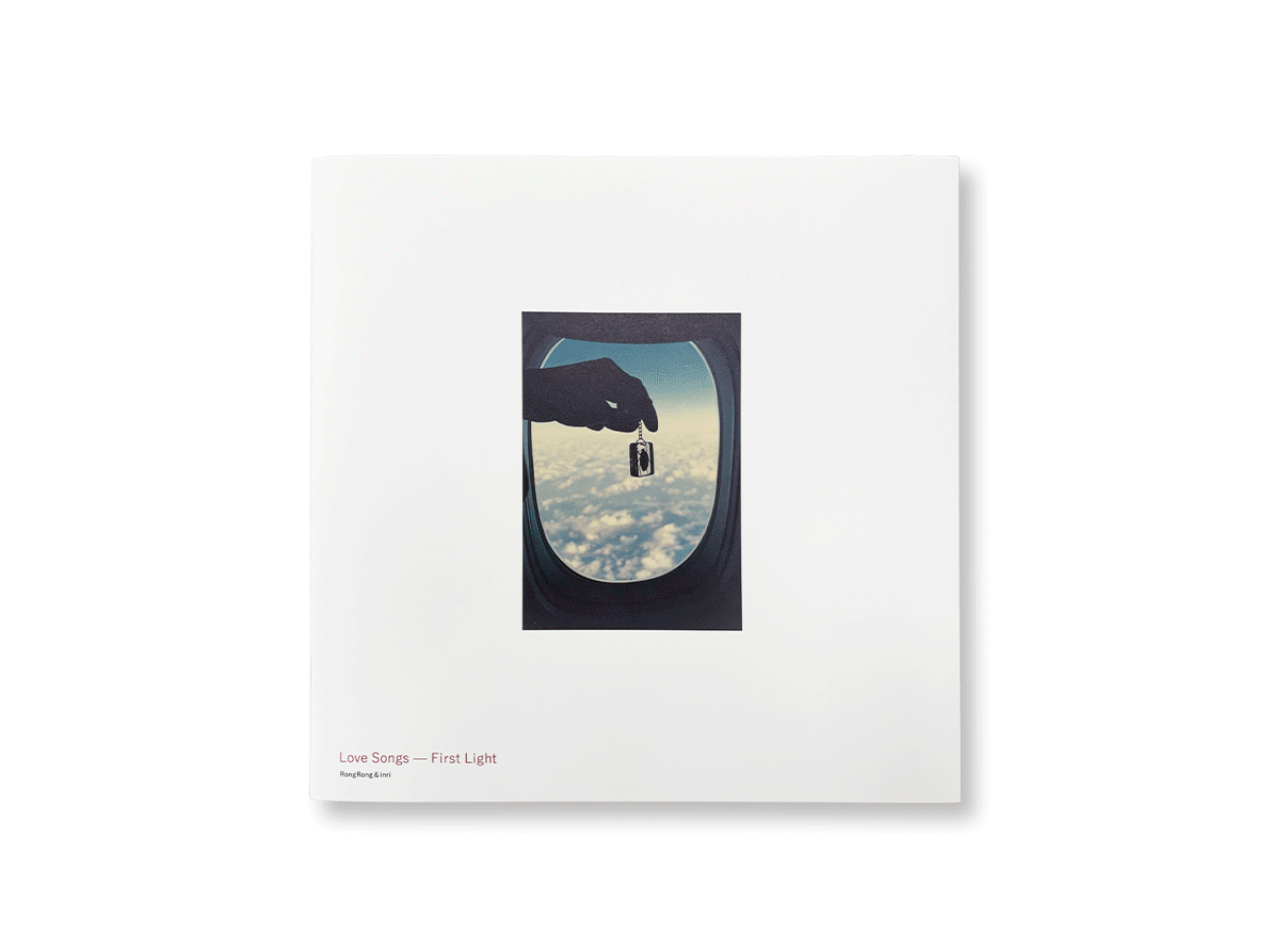
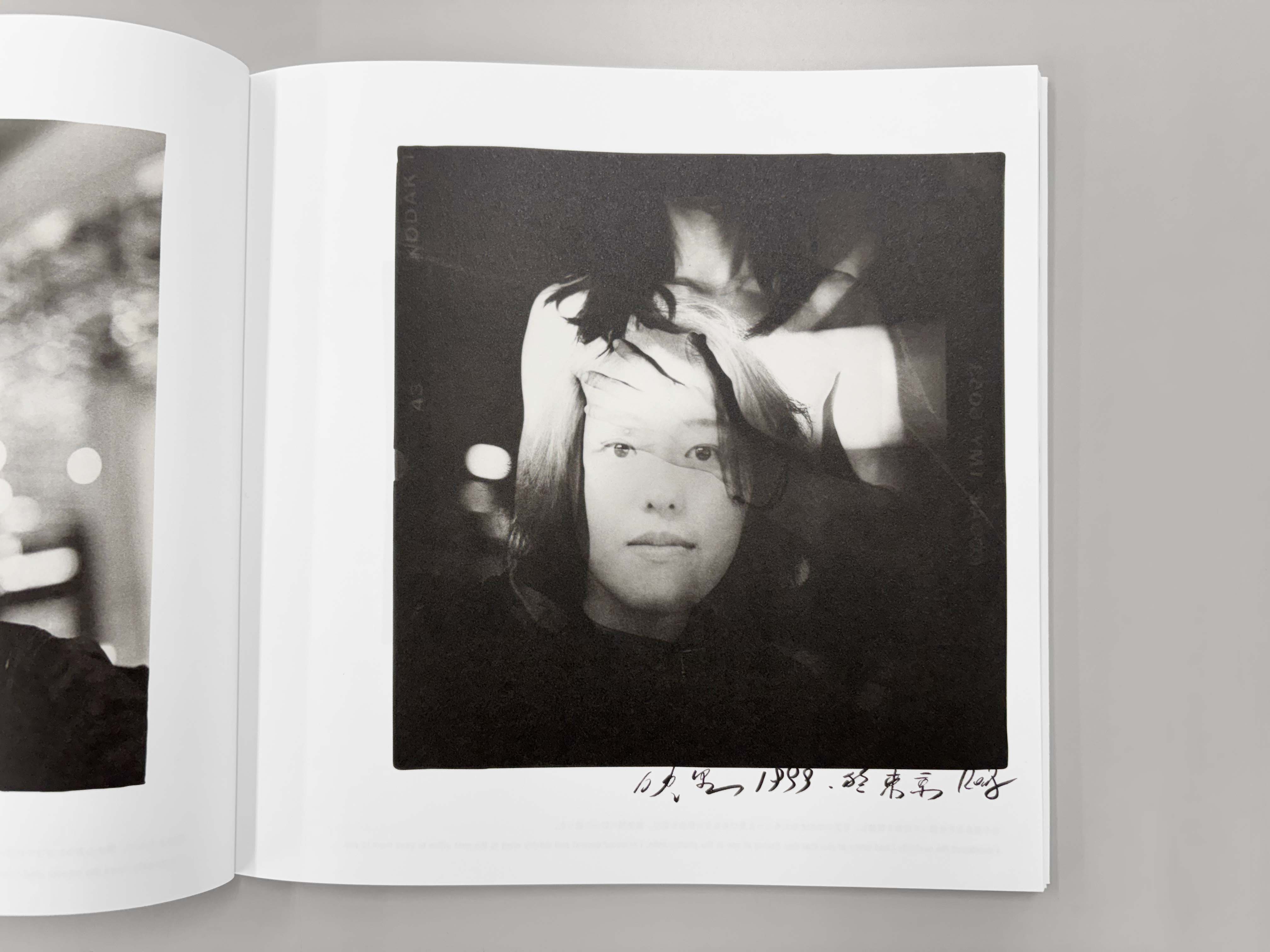
当時の二人のラブレターは、プリント、ポラロイド、手紙、コピーなど、多種多様な原稿に手書きの言葉が添えられているのが特徴です。印刷設計においては、本文用紙である「OK白王」の豊かな風合いを加味し、オリジナル原稿の持つテイストを大切にしつつ、調子も濃度も差のあるプリントの調子を合わせることにより、一冊の作品集としての流れと統一感を持たせることに注力しました。
モノクロ写真は繊細な階調表現と濃度感を出しつつ印刷の安定性も考慮して、スミ版をメインに据えた分解・製版を行っています。オリジナルプリントと手書き文字の微細な調子やニュアンスを忠実に再現すべく、誠晃印刷の高精細印刷を採用しています。仕様にこだわる一方で、特色の赤色をプロセスインキで表現するための調整や面付けの変更などのコスト削減の対策も行っています。
製本は並製本ですが、かがり綴じを採用。ワンポイントで二人の絆を表す「赤い糸」でかがっています。
これらは造本設計を担った町口覚氏、プリンティングディレクター糸川正悟、各工程を支える誠晃印刷の熟練した社員たちによって、実現できたものです。
本写真集の出版を記念し、KYOTOGRAPHIE 2026 / KG+の会期に合わせて日本初公開となる展覧会「Love Songs ― 始まりの光」が京都にて開催されました。また、会期中には出版記念トークイベントやポートフォリオレビューなども展開され、作品の世界観をより深く体感できる場となりました。
赤々舎:https://akaaka.com
RongRong&inri | 榮榮&映里:https://www.rongin.com
造本設計:町口覚
デザイン:宮一紀(マッチアンドカンパニー)
プリンティングディレクター:糸川正悟
プリンティングマネージャー:石川泰彦、矢部寛和
判型:縦240mm/横240mm
頁数:108頁
用紙
・カバー:マシュマロCoC
・表紙:気泡紙U-FS ディープラフ
・本文:OK白王
・製本:糸かがり並製本
言語:英語/日本語
Client: AKAAKA Art Publishing
Title: RongRong & inri | Love Songs — The Light of Beginning
RongRong (China) and inri (Japan) are a photographic duo active since 2000, whose collaborative practice has poetically and experimentally explored human relationships through photography. Their works are included in the collections of major international museums such as Tate Modern, Maison Européenne de la Photographie, and M+, and they have received broad international acclaim.
This publication is a collection of the “photographic letters” exchanged shortly after the two artists first met. Transcending language barriers, these photographs served as a means of communicating emotion, capturing the very origin of their relationship. Carefully preserved over many years and previously exhibited internationally, the works were ultimately realized as a single volume for their first public presentation in Japan through the book design direction of Satoru Machiguchi of Match and Company.
The original “love letters” exchanged between the artists consist of highly diverse materials — including photographic prints, Polaroids, handwritten letters, and photocopies — all featuring handwritten messages. In the printing design process, careful consideration was given to preserving the texture and atmosphere of the original materials while taking advantage of the rich tactile quality of the main text paper, OK Hakuo. Particular emphasis was placed on harmonizing the varying tones and densities of the source prints in order to create a cohesive visual flow and unified reading experience throughout the book.
For the monochrome photographs, special separation and plate-making processes centered on the black plate were employed to achieve delicate tonal gradation and rich density while ensuring printing stability. Seiko Printing’s high-definition printing technology was utilized to faithfully reproduce the subtle nuances and fine tonal details of both the original photographic prints and handwritten text. While maintaining a strong commitment to the book’s specifications and craftsmanship, cost-efficiency measures were also implemented, including adjustments to reproduce the spot red color using process inks and modifications to the imposition layout.
Although produced as a softcover edition, the book adopts Smyth-sewn binding for durability and refined craftsmanship. As a symbolic detail representing the bond between the two artists, the volume is sewn with a distinctive “red thread.”
These achievements were realized through the collaboration of book designer Satoru Machiguchi, printing director Shogo Itokawa, and the highly skilled staff of Seiko Printing who supported every stage of the production process.
To commemorate the publication of this photobook, the exhibition Love Songs — The Light of Beginning was held in Kyoto as the first presentation of the work in Japan, coinciding with KYOTOGRAPHIE 2026 / KG+. During the exhibition period, publication commemorative talk events and portfolio reviews were also held, offering visitors an opportunity to engage more deeply with the world embodied in the work.
AKAAKA Art Publishing Official Site:https://akaaka.com
RongRong & inri Official Site:https://www.rongin.com
Book Design: Satoru Machiguchi
Design: Kazunori Miya (Match and Company)
Printing Director: Shogo Itokawa
printing manager: Yasuhiko Ishikawa, Hirokazu Yabe
Size:240x240mm(HxW)
Pages:108
Paper
・Jacket: Marshmallow CoC
・Cover: Kihoshi U-FS Deep Rough
・Text: OK Hakuo
Binding:Smyth-sewn softcover binding
Language:English,Japanese


印刷物の企画、デザイン、印刷、製本に至るまで、お客様の目的に応じた最適なプランをご提案させていただきます。